
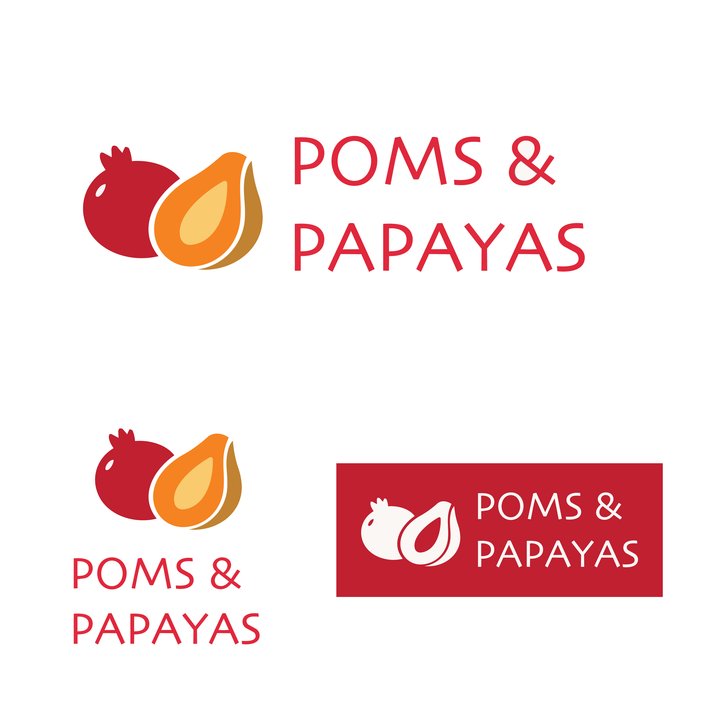
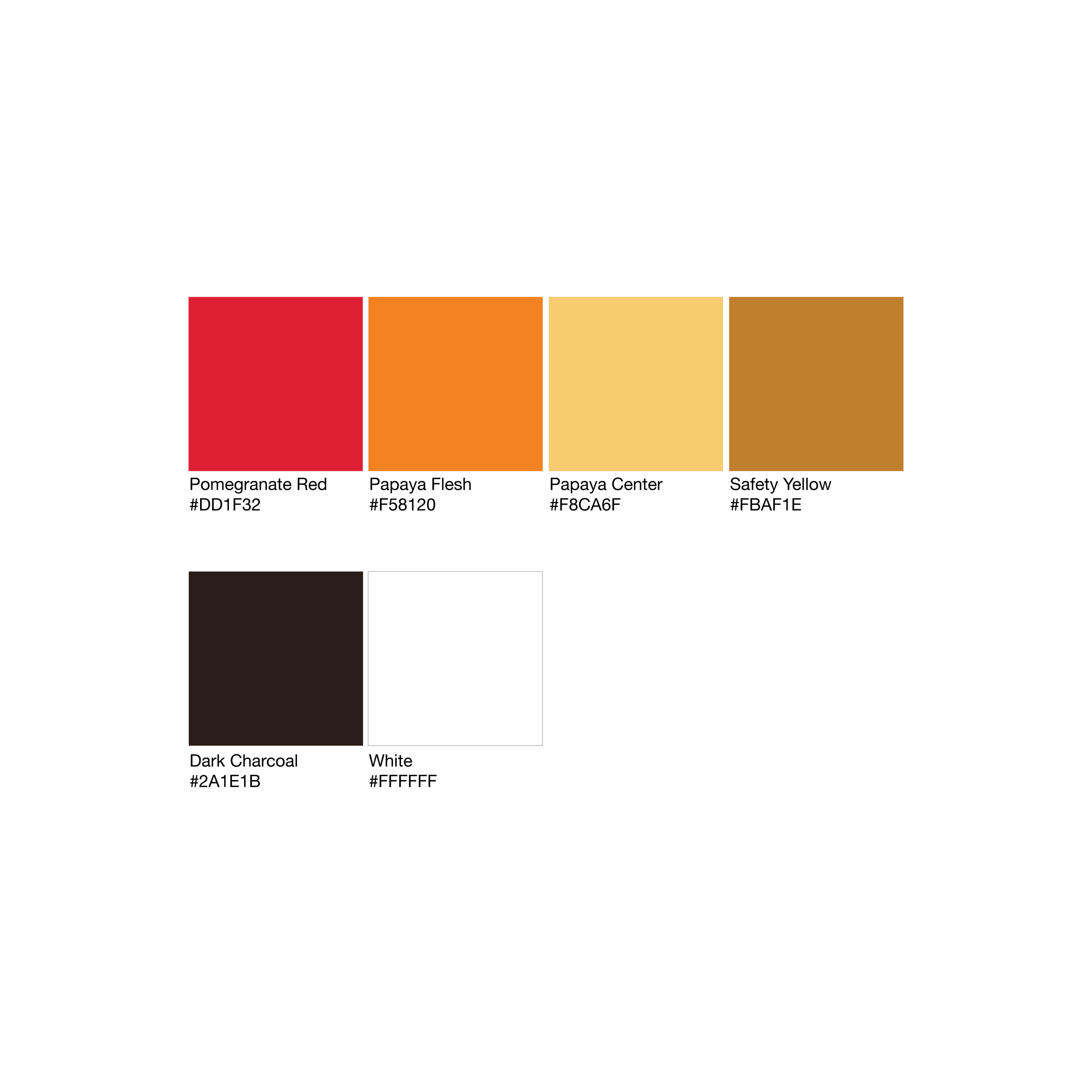
POMS & PAPAYAS
Role: Brand & Production Designer
Scope: Brand system, packaging, marketing assets
Focus: Consumer brand applied across print and digital
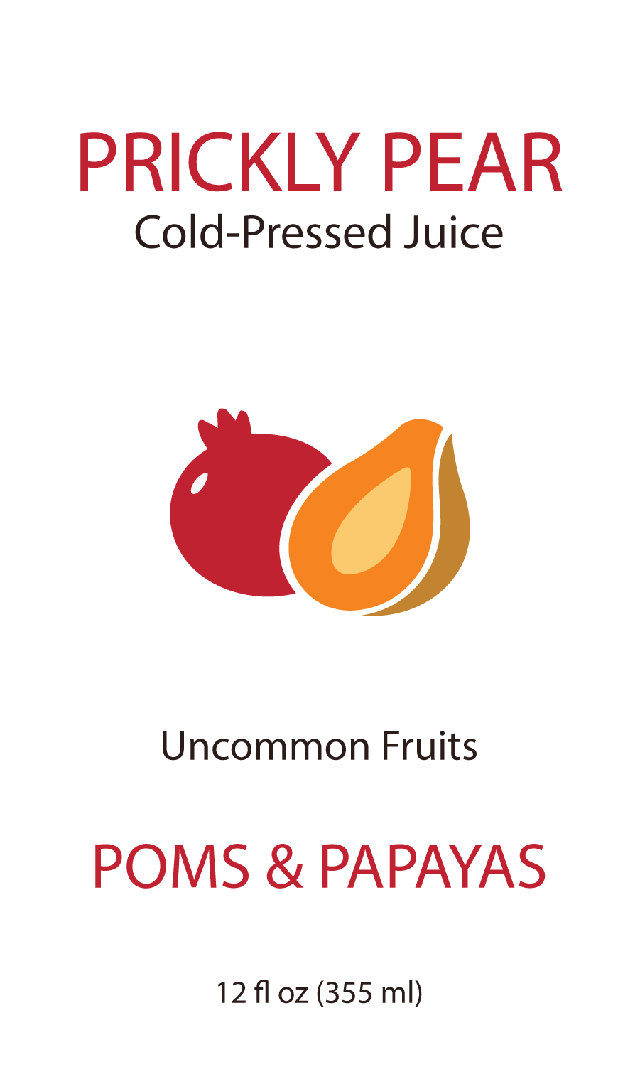
Product label — CMYK

Sticker— CMYK
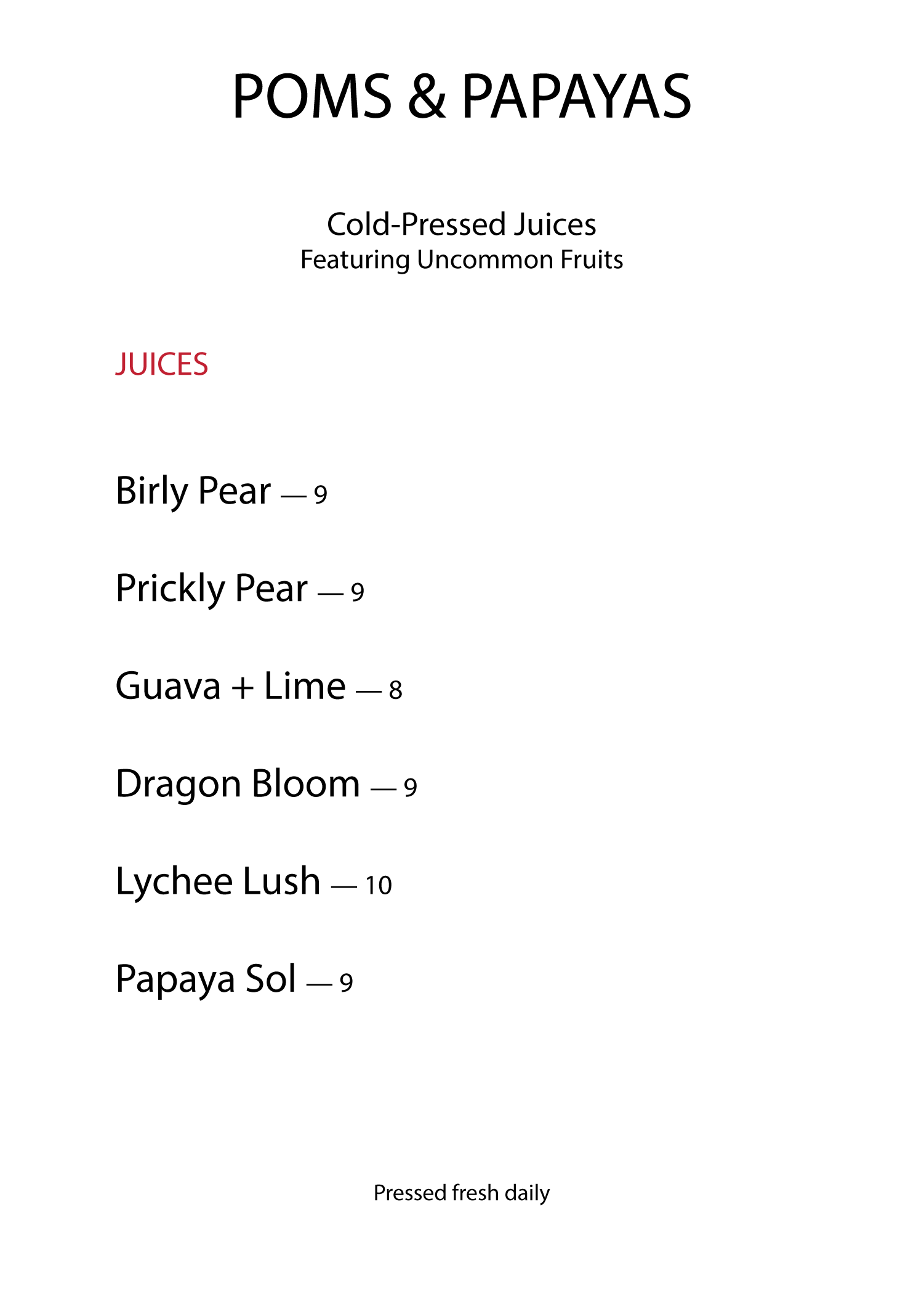
Menu insert — CMYK
Instagram post — RGB