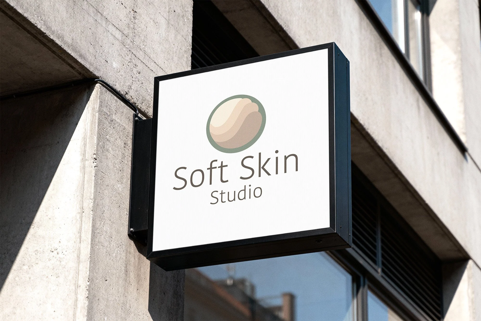
SOFT SKIN STUDIO
Project Details
Industry
Skin care and esthetic services studio
Audience
Clients seeking gentle, skin-focused treatments in an inclusive, non-intimidating environment
Primary Goal
Create a welcoming brand that builds comfort and trust at first glance
Business Challenge
Design an identity that feels calm and inclusive while remaining clear, professional, and easy to use across everyday studio touchpoints
Brand Feel
Calm · Warm · Clean · Reassuring
Visual Strategy
Minimal structure and restrained styling used to support clarity, comfort, and accessibility across a broad audience
Color Direction
Warm taupe typography, soft sage accents, and an inclusive range of natural skin tones, with color concentrated in the icon to maintain legibility across applications
Key Applications
Studio signage · Booking website · Social media · Product packaging
Primary Logo
Secondary Logo - Stacked
Secondary Logo - Wordmark
Brand Mark
Color Palette
Typography

