

PERRY PALETTE DESIGN
Project Details
Industry
Branding and visual design studio
Audience
Small business owners, creatives, and service-based founders
Primary Goal
Establish a clear, cohesive studio identity that communicates creative capability, trust, and intentional design systems
Business Challenge
Create a brand that feels creative and approachable while remaining simple, professional, and easy to recognize across client-facing and internal use
Brand Feel
Thoughtful · Elevated · Approachable · Confident
Visual Strategy
An editorial approach paired with a playful symbol to balance clarity, personality, and memorability without visual complexity
Color Direction
A flexible, curated color system that allows variation while maintaining cohesion, with pink adding warmth and green grounding the core mark
Key Applications
Website · Portfolio · Social platforms · Proposals · Brand assets · Internal studio materials
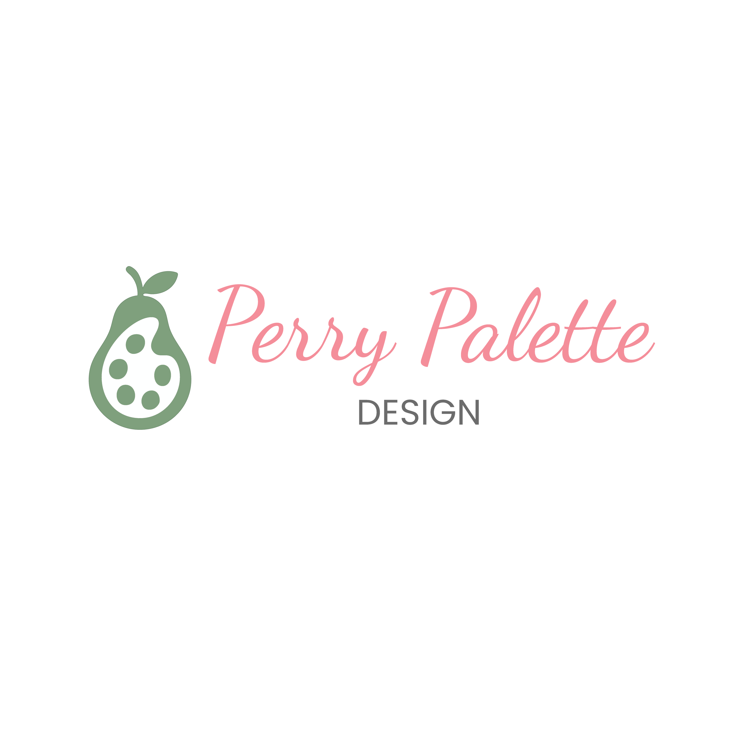
Primary Logo
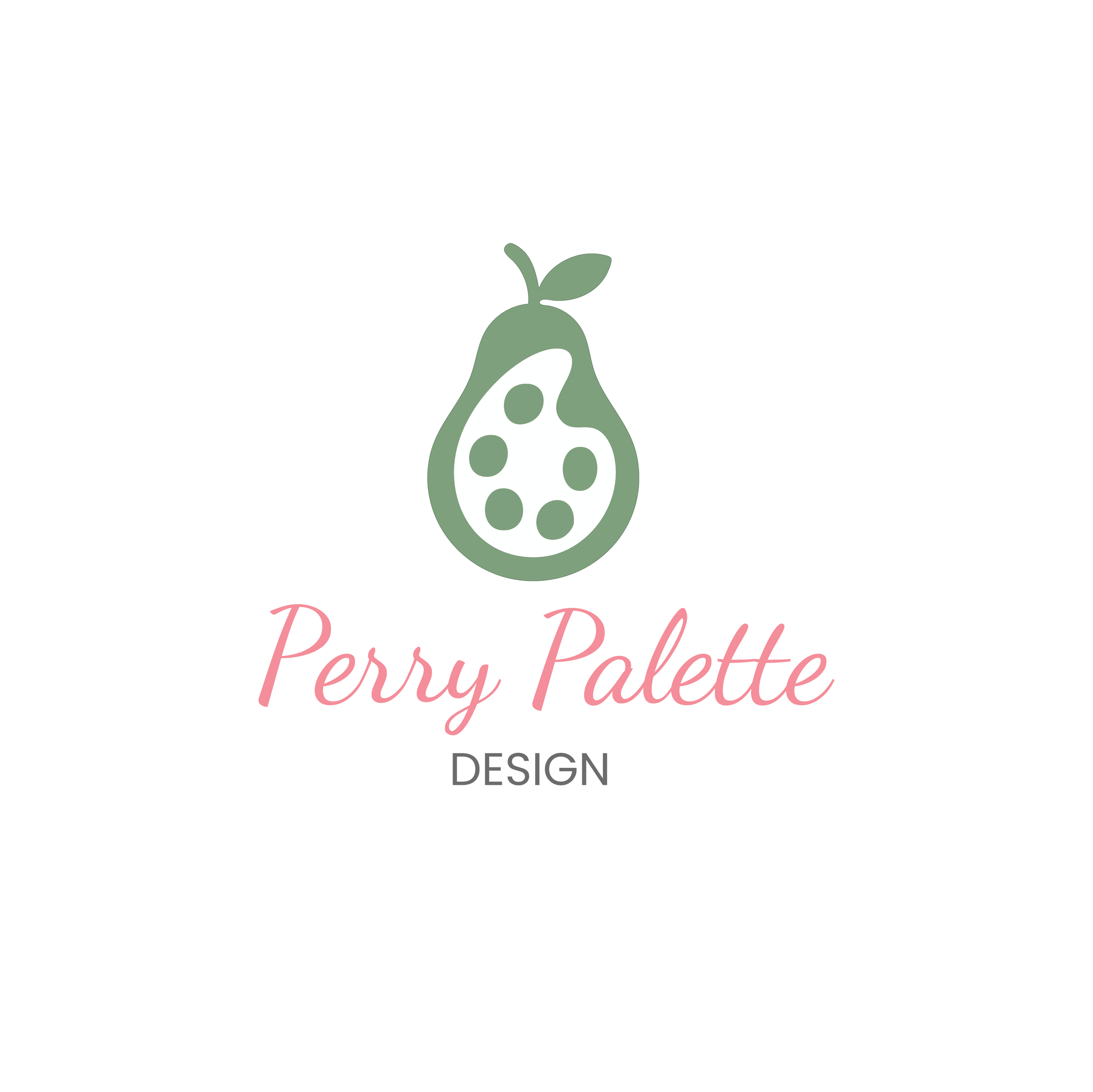
Secondary Logo - Stacked
Secondary Logo - Wordmark

Brand Mark
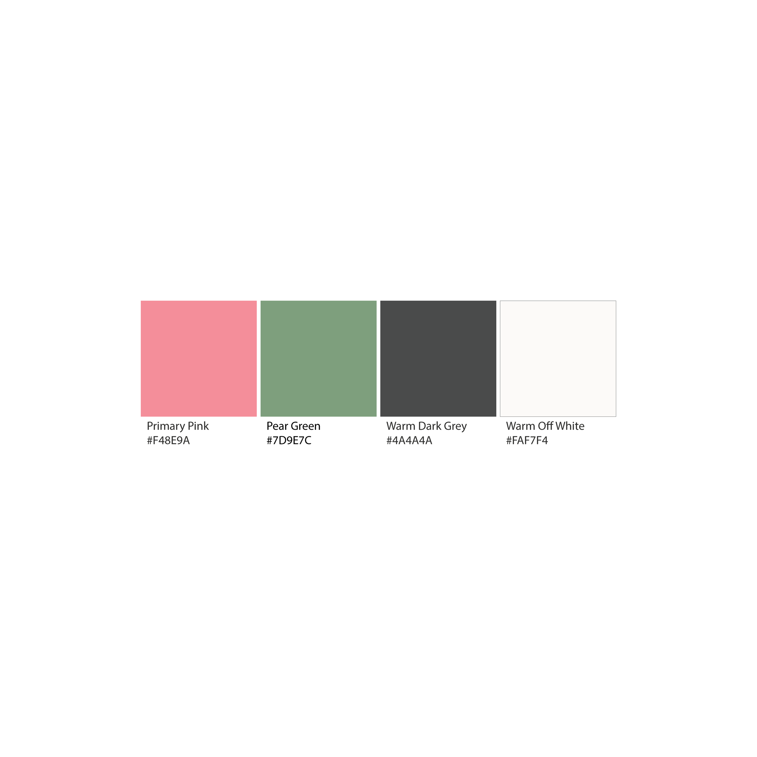
Color Palette
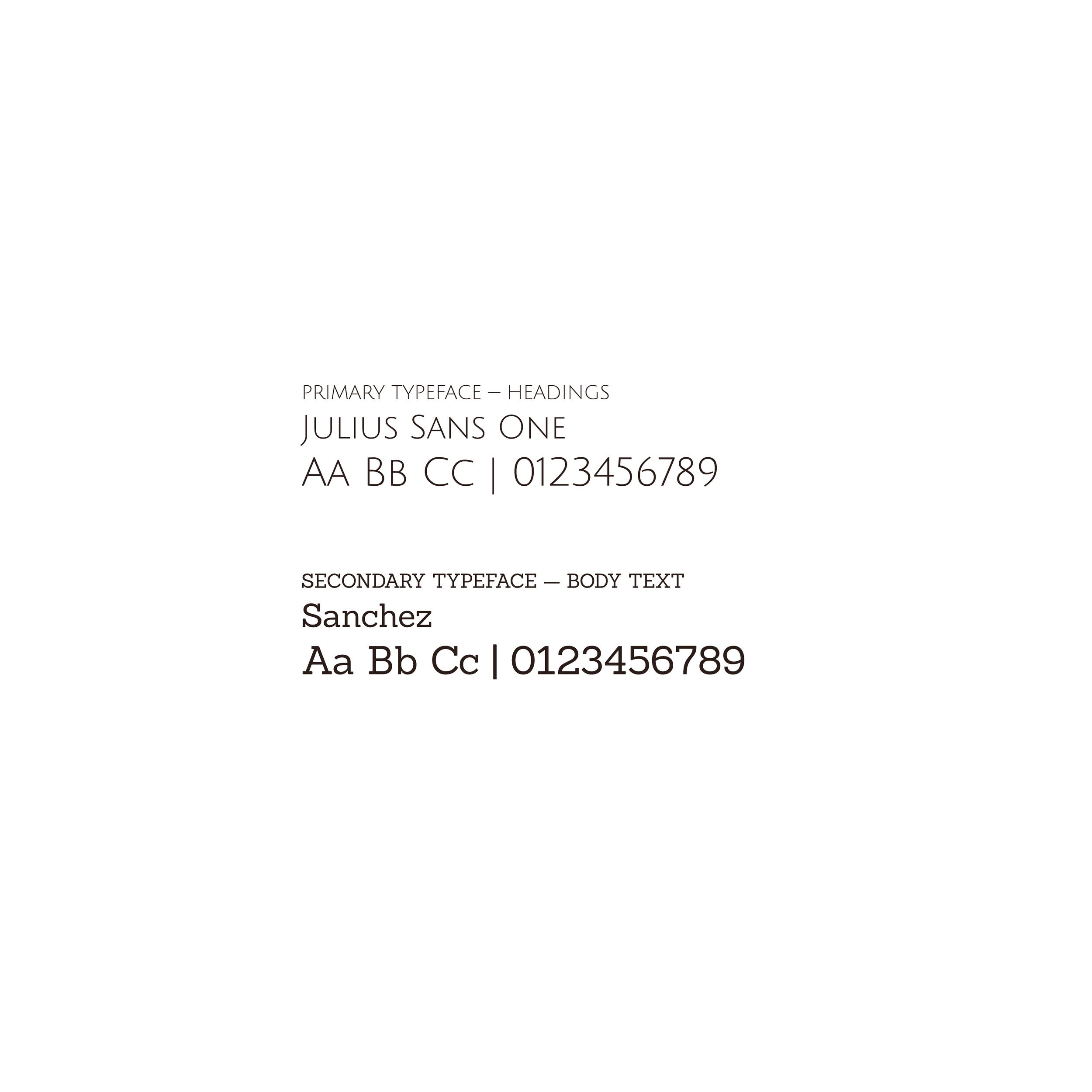
Typography